Foundational upliftment of Atlassian Marketplace - introducing a consistent and scalable brand language and style
Problem context - why a UI uplift?
Atlassian Marketplace ran on a legacy tech stack and design system which over the years had grown into a mismatched pile of code bits and design styles.
While always a sanity concern, it continued for 5 years until the effect on our internal operations became starkly noticeable.
It is important to note that the dated UI did not affect our customers largely, who had gotten used to it. However, things were not so easy for the team behind Marketplace.
The legacy tech stack made it hard for us to:
-
Make simple decisions
-
Very rudimentary instrumentation present and could not add more
-
Could not conduct A/B tests and the like
-
-
Introduce any complicated UI or flow changes
-
Time-to-ship was almost 2x
-
Introducing new elements was complicated and as a result - avoided
-
Due to bandwidth constraints and the apparent lack of the immediate business value of this project, it was deprioritised for quite long - until now.
Hence, the brief was not simply a redesign project but an entire foundational overhaul to lay down the new stones for Marketplace.
Product brief
add flashy image
Goals
Of course, a foundational upliftment wouldn't be complete without picking up low-hanging fruits from our backlog. So after scoping, we narrowed our goals as -
Internal business goals
-
Migrate onto new code
-
-
Decrease future development time by compartmentalisation
-
External experience goals
-
Create a consistent branding (tone, design language)
-
Offer credible guidance to match their evaluation criteria
-
Quick evaluation (including rejection)
-
Site benchmarking (a11y, responsive, design foundations
Program plan
Of course, a foundational upliftment wouldn't be complete without picking up low-hanging fruits from our backlog. So after scoping, we narrowed our goals as -
Program plan
Of course, a foundational upliftment wouldn't be complete without picking up low-hanging fruits from our backlog. So after scoping, we narrowed our goals as -
Understanding user behaviour on the app listing page
The key task performed on the App listing page is Evaluation.
Users in the journey exhibit a wide spectrum of mindsets based on their roles and organisational structure and perform different parts of the task. We narrowed it down to 3 archetypes that best represented each cohort and covered the entire journey.

This helped us formulate our brief for each persona, catering to their immediate goals as they land on the listing page:

Pain point assimilation (for Customers)
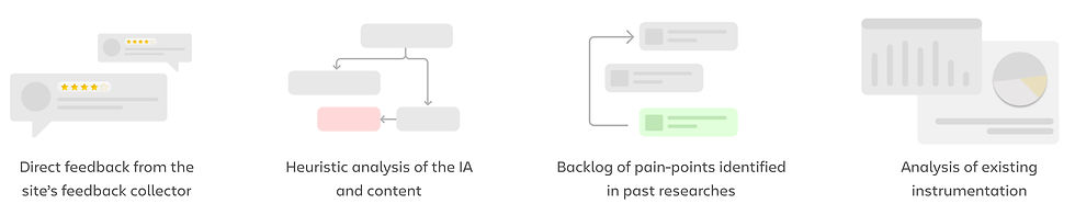
We used 4 channels to help us identify existing painpoints, and mapped them onto the right archetype.
The major challenges identified with the existing site were:

Pain point assimilation (for Atlassian)
We used 4 channels to help us identify existing painpoints, and mapped them onto the right archetype.
Add flashy cover image for redesign
Changing the Information Hierarchy
We looked at the information presented on the page created a UI-agnostic mapping of the current content. Distance between the bubbles indicate visual distance in real life.

Older informationgrouping
With our understanding of the pain points and customer behaviour while evaluating, we created a new information hierarchy and grouping by re-structuring existing data pieces only.
The major intervention was introduction of a mid-level piece containing evaluation essentials or 'highlights' that would help customers quickly navigate to an area of choice.

Proposed information grouping
Explorations
The entire page was then broken down into smaller components and assigned. I worked on the Header, Overview section and Privacy and Security section. We also discussed if the page layout should remain tabbed or not.

Timeline ⏳
4 weeks
Platform 🖥️
Responsive website
Status 📈
Phased roll-out ongoing
Team 🤝
1 Designer, 1 PM,
4 developers
Final designs, post harmonisation
As this was a large project, we decided to roll it out in phases. To avoid any disruption, the initial rollout would not include the evaluations essentials section, as we wanted to conduct an A/B test to figure out its effectiveness.
Older app listing landing page

New app listing landing page

Impact
Given the number of people who land on this page regularly, the new designs are being strategically released in phases, and the final release is still pending. Preliminary feedback received indicated several anticipated benefits such as improved evaluation efficiency and lesser errors in hosting selections.

Impact
Customer POV:
Given the number of people who land on this page regularly, the new designs are being strategically released in phases, and the final release is still pending. Preliminary feedback received indicated several anticipated benefits such as improved evaluation efficiency and lesser errors in hosting selections.
Internal systems:
Learnings
This re-design was necessary to move on to the new tech stack and allow us to start baselining our experience in terms of SEQ, accessibility